Hello and welcome to my new blog. Today I am going to teach you how to make histograms in excel quickly. First of all, what is a histogram good for? Well, it's great for checking how the data is spread within a range.
How to make histogram in excel
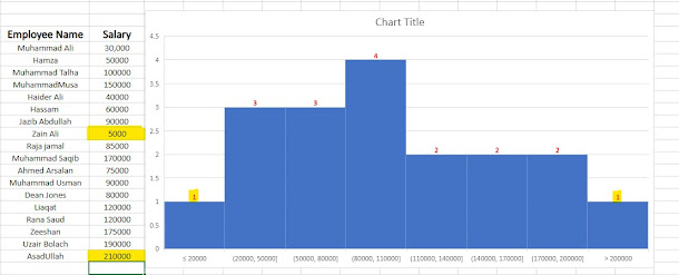
Let's get started and make a histogram in excel. So in our case, we're taking a look at salary distribution. We have specified these groupings here, and we can quickly tell that how many people fall in which salary range. Let's make this from scratch. Here's our dataset. We have employee names and the yearly salary. So based on this, I want to create a histogram chart. What I'm going to select the data, go to Insert in the menu bar, and insert the histogram.
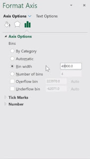
Now you might be fine with the standard histogram chart that you get, but you probably will want to adjust the bins here because what Excel does is it tries to automatically guess the best fitting range based on your dataset, but you might want to analyze the data in different ranges. You can specify that in the options. So just activate the axis by just clicking on it and bring up the Axis Options or you can use the shortcut key Control + 1.
Also Read 66 Best Excel shortcuts you must know
How to protect yourself from cybercrime
Right here, we can see it's set to automatic, but we can decide the bin width by ourselves, which means the width of the range here. So instead of 50,000, I'm going to change that to 30,000 and press Enter.
Immediately I can see that the number of bins changed from four to six. It would also be nice to have the ranges rounded to thousands. I can control that, so for this, I can define the Overflow and the Underflow bin.
For the Overflow bin, which means the highest point that I want to have here is something I'm going to manually set. I'll change that from 210000 to 200,000 and press Enter.
For the Underflow bin, I'm going to change that as well. So instead of the minus value, I'll change it to 20,000 and press Enter. Now, my ranges look a lot neater. Now if I put some value or change value above 200000 or under 20000 it looks like:
Also Read: How to make money from Facebook in 8 different ways
All I have to do is to activate the data labels. So select the series,
right-mouse click, Add Data Labels. Let's make them a bit bigger so they stand
out more and make them bold. You can also change the color, font type, etc. And all of this is automatic. If you're already using histograms in your files, comment below and let us know
what you're using them for. I hope this will help you in making histograms in excel.


No comments:
Post a Comment
Let me know your thoughts